
I Love Hue Too! II

A couple months ago I wrote a blog post about working with various color apps to develop a finer-tuned sense of color nuances - https://doubleweaver.com/i-love-hue-too/. One of these apps, I Love Hue, has become a particular favorite of mine. As you work your way through solving the color grids you advance in levels of difficulty. At the time that I wrote the previous post I was working with fairly complex rectangular grids, and it’s fun to think about how some of them might be inspirations for woven designs.

Since that time, as I have progressed up a few levels, I am now working with hexagonal grids. These are even more interesting and challenging, because now instead of having to think about the movement of color in two directions you have to think about the movement going in three directions.

Scrambling the colored triangles and putting them back in order really tests your ability to look at the colors from the attributes of hue, value and saturation all at once. Obviously, this doesn’t translate into weaving as well as the rectangular grid, but it is a great exercise in seeing the subtle nuances of color.

Since much of my life this past year has been spent teaching my Double Rainbow workshop on zoom I have spent a lot of time thinking about color. Several months ago I embarked on a self-study program exploring different approaches to color theory and practice. Some of this has been through reading books, some of it has been through weaving my own color studies, and some of it has been through taking guided courses with books or online programs.
Since I enjoy the medium of colored pencil I went through the exercises in a book called Colors, A Workbook: Matching, Mixing & Selection for Colored Pencils by Amy Lindenberger. Working with a set of twelve pencils in the primary, secondary and tertiary colors you learn to create color mixtures by overlaying multiple layers of pencil colors on top of each other.

I’ve been familiar with the work of Josef Albers, Johannes Itten, and other classic color theorists for a number of years, but while I had heard of the Munsell system, I really didn’t know much about it. The Tubular Spectrum by Lunatic Fringe Yarns is based on the Munsell system, and since I am using their yarns in my workshop I decided that I needed to learn more about it.
While most approaches to working with color that I am familiar with involve mixing paints by starting with three primary colors (which can vary from sysytem to system), the Munsell system approaches color from a point of view of how we perceive color. I find that this resonates for me since I design with colors based on how I perceive them, rather than based on any specific theory.
Munsell has an extensive program of student studies that can be done in a class, but also is available through an interactive book. There have been several editions of this over the years, and I was able to find a new set in the third edition.

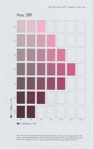
The set contains packets of colored chips and a number of interactive charts that you fill in with the chips provided. This is the chart that shows the ten base hues in full chroma, or saturation, one color in its chroma range and a value scale.

Then for each of the ten base hues you get a packet with multiple color chips in a range of chroma and value, and a chart to fill in with the chips in the correct order. The difference from one chip to another can be very subtle and require that you look very closely to determine the levels of value and chroma. The answers aren’t given in the book, so it is up to you to keep working with the arrangement of the chips until everything feels just right.
This is where I feel the hours I have spent playing with the apps such as I Love Hue have really paid off. I’m finding that I can see those subtle variations and distinguish between changes in value and chroma much more readily than I could a few months ago. It really does count as research to play the games on these apps!
When you look at the leftmost column on each of these charts, which is where you see the lowest chroma, or saturation, of the hues, you are seeing very neutral greyish and brownish tones and shades. This can be helpful for looking at neutrals and being able to determine what the underlying hue is, since very few neutrals are composed of pure black and white.
I don’t know where all this might lead in weaving, but I have plenty of ideas to keep me busy for a long time. I recently wove a couple samples with a warp in a value gradation of white through black. The structure is doubleweave 2-block windows on eight shafts. In the first piece I used a single tone of blue for my accent weft color throughout the weaving so that I could see how it would change in appearance based on the surrounding background values.

For the the second sample I moved the weft through a spectrum of pastel colors from one row of windows to the next. It’s interesting to compare the front and back sides of both samples and see how much the shift in position of the blocks changes its appearance. This affects which colors come forward and which recede, and also creates an optical bending of the lines.

These may well become the inspiration for larger pieces. At this point I’m enjoying the process of experimenting with these ideas and weaving the samples for their own sake. I can see how Josef Albers spent many years on his Homage to the Square series, and can well imagine that I might have many years of exploring these ideas in weaving myself.